

Here's one of the works I did in Narrative Illustration this semeseter. I got an A in the class!

This one was painted in gouache, which was quite a challenge to figure out.


 The inks for the penciled page I posted here a month or so ago. I quite
like the way that the father's body falls into shadow in the last
panel. It wasn't really something I'd planned for, but I'd like things
like that to happen more often.
The inks for the penciled page I posted here a month or so ago. I quite
like the way that the father's body falls into shadow in the last
panel. It wasn't really something I'd planned for, but I'd like things
like that to happen more often.


 These are some of my concepts and development work for designing the main character, Sofia.


 After that, it's inking. It's pretty self explanatory, but I try to make sure I get as much line weight as I can. I also try to make sure that there's a balance of black in the pages because I don't want the structure of the forms and the drawings to rely on the coloring to be completed.
  On coloring, establishing the color scheme takes the most time. I tend to use a gamut masking technique where I keep things desaturated unless it's very important. This page is very desaturated without the high point because I wanted it to have a very particular tone. The flats are also useful because you can select all the colors and change them as you need to. This is the second page, so I didn't actually do that, but on the first page, I just copied the original character design colors and adjusted them to fit this tone and color scheme.
  After the flats, I add a multiply layer and establish the values and shadows. I usually try to have pretty sharp lines on the shadows, but for these pages, there's sand blowing and ambient light, so there isn't a strong light source casting strong shadows. Another thing I did a little less on this page was framing the panels with the values. If I were going to make something into a silhouette, I would be doing it at this stage. I do add a layer that is a black gradient to help direct the eye around the page. If I don't want the viewer to look at the outer parts of the panel, then I will make that part a little darker so it's less noticeable. After that, adding the textures helps make the page look a little more lively, as well as avoiding that airbrushed-I-colored-this-in-photoshop look that so many comics have. It can really ruin good pencils or inks to have crappy flat colors and gradients. I've made very high resolution watercolor textures that I apply on top on the overlay setting at about 35% opacity. Finally, I add the effects and some halftones.
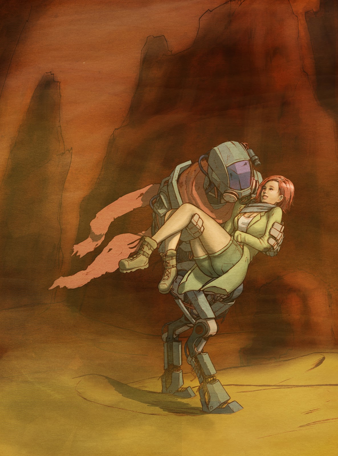
 This was done for my digital painting 2 class, taught by Will Terry. You can check out his stuff at http://willterry.com or at willterry.blogspot.com


