

Subscribe To

 Posts
All Comments
Posts
All Comments
Saturday, March 23, 2013
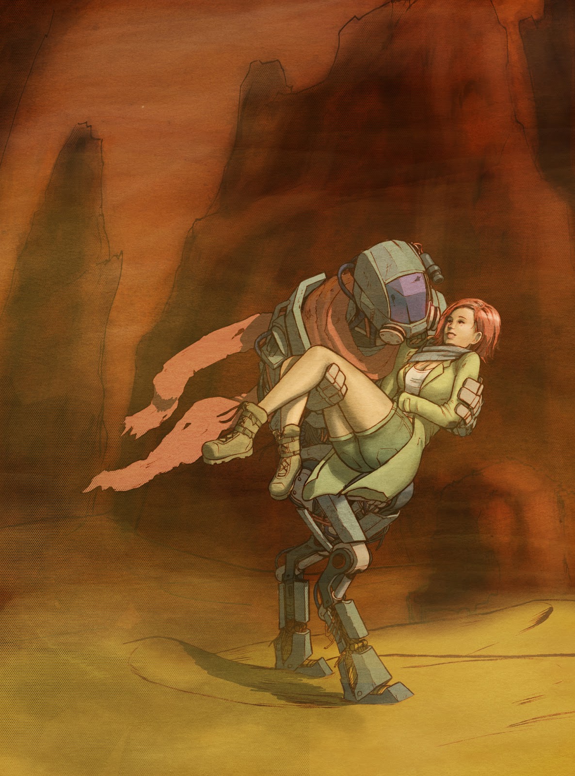
A robot saves a girl in the desert

Monday, February 18, 2013
BFA page 2 Process

First I start with the blue line drawing. I use two steps at this part where I draw the gestures and basic shapes using my 2mm lead holder with the Turquoise brand lead. It's not as soft, and it's really waxy, so it's hard to get dark lines. It's also actually turquoise colored, so when I go over the gestures with my .5 mm blue mechanical pencil, it doesn't show through much.

 After that, it's inking. It's pretty self explanatory, but I try to make sure I get as much line weight as I can. I also try to make sure that there's a balance of black in the pages because I don't want the structure of the forms and the drawings to rely on the coloring to be completed.
  On coloring, establishing the color scheme takes the most time. I tend to use a gamut masking technique where I keep things desaturated unless it's very important. This page is very desaturated without the high point because I wanted it to have a very particular tone. The flats are also useful because you can select all the colors and change them as you need to. This is the second page, so I didn't actually do that, but on the first page, I just copied the original character design colors and adjusted them to fit this tone and color scheme.
  After the flats, I add a multiply layer and establish the values and shadows. I usually try to have pretty sharp lines on the shadows, but for these pages, there's sand blowing and ambient light, so there isn't a strong light source casting strong shadows. Another thing I did a little less on this page was framing the panels with the values. If I were going to make something into a silhouette, I would be doing it at this stage. I do add a layer that is a black gradient to help direct the eye around the page. If I don't want the viewer to look at the outer parts of the panel, then I will make that part a little darker so it's less noticeable. After that, adding the textures helps make the page look a little more lively, as well as avoiding that airbrushed-I-colored-this-in-photoshop look that so many comics have. It can really ruin good pencils or inks to have crappy flat colors and gradients. I've made very high resolution watercolor textures that I apply on top on the overlay setting at about 35% opacity. Finally, I add the effects and some halftones.
Tuesday, February 5, 2013
Red Riding Hood and the Wolf
 This was done for my digital painting 2 class, taught by Will Terry. You can check out his stuff at http://willterry.com or at willterry.blogspot.com
Sunday, January 27, 2013
Cintiq!

Thanks to the generosity of my parents, I am now the proud owner of the 22HD Cintiq. For a long time I had been using a tablet pc (the HP tm2t, which was pretty good) as my main digital drawing tool. Tablet pc's are nice because they are full on laptops, and therefore portable and convenient, and I thought more than good enough for doing art. I figured that using a cintiq couldn't be that different from using my laptop for drawing and painting, but I was totally wrong. The Cintiq is so sensitive, way more so than the tablet pc. It has so many functions as well, including the sixteen buttons and two touchstrips on the back.

It is a fantastic piece of technology... and I don't think anyone would regret buying it, though it is such a huge investment.
And here is some samples of what I've done with it. Most of them are just coloring, but there's a couple drawings as well :)


Sunday, December 30, 2012
Coloring Practice
So at the end of this past fall semester, I was having an existential
coloring crisis, partly because I was told that my colors looked like a
fruit by the foot. I decided to try coloring some linework by other
people, just to save a little bit of time really, and I ended up really
enjoying what I was doing. It turns out that I might end up enjoying
being a colorist, which is something that I never expected of myself. I
have always had a hard time coloring and making color choices. I will include links to all the original artists where I can.


http://danielleister.deviantart.com/
http://spacefriend-krunk.deviantart.com/


http://williamdresden.deviantart.com/
http://spacefriend-krunk.deviantart.com/
http://geddlee.deviantart.com/

Saturday, December 8, 2012
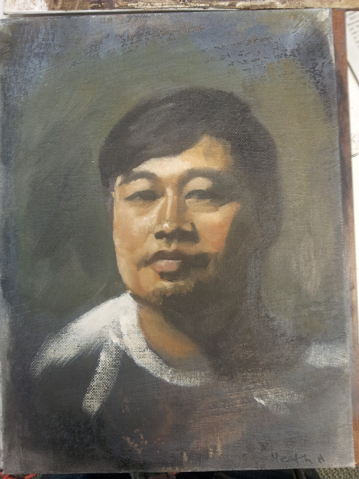
Select Head Paintings
This semester I took painting the human head with Don Seegmiller, and he is a fantastic teacher. It's been one of the best classes I've ever had, and I got soooo much better. I didn't really think that I'd like painting with oils, but by the end, I understand why they are so prevalent among traditional artists. They're smooth, they flow, and they do what you want, as long as you've put in the time to learn how they work.




Wednesday, October 3, 2012
Concept Design
It's been a while.. but I have something to post for now, which is a part of why I hadn't been. I love drawing comics, but one of the problems is that if you don't have everything done, you can't really post it unless you can regularly update, which I can't. Anyway, I'm in "concept design 1" this semester, and at first it sounded like fun, but then it got really stressful. I did make some pieces that I'm proud of for it, but it was a somewhat frustrating and often unrefined experience, but we're all learning, including the teacher.
The assignment was to design as if we were on a real production team and we were working within a current franchise, which happened to be Resident Evil. I had to design a car, which was... difficult, but I put in the time, and I think it turned out. I also designed a possible co-op character, even though it wasn't assigned. I think that it just took some time for things to get set up in the class


The assignment was to design as if we were on a real production team and we were working within a current franchise, which happened to be Resident Evil. I had to design a car, which was... difficult, but I put in the time, and I think it turned out. I also designed a possible co-op character, even though it wasn't assigned. I think that it just took some time for things to get set up in the class


Subscribe to:
Posts (Atom)